Tag Archives: typography

TYPE 1: The Process Of Project One (Part 3)

The first project in Type 1, I feel, was all about the study of the anatomy of typefaces. It dealt with deconstructing letterforms, determining the characteristics of the letterform, then abstracting it or creating a perfect reproduction of it.

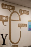
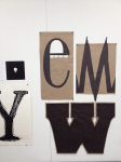
The third part of the first project was about recreating one of the previous letters we did in the second portion of the first project, then labeling the anatomical portions with the correct terminology. I chose to recreate the Bodoni ‘e’ but I decided to work on a much larger scale. Since the Bodoni ‘e’ looks like it has so much personality, I decided to once again abstract the piece and bring out its personality characteristics. I elongated the body of the letterform so that it more resembled a talkative face. Then, I cut out the terms in the shapes of speech bubbles (much like in a comic book). The letterforms in the speech bubbles are all hand illustrated, which allows them each to be different and, in turn, have their own personality as well.

Tagged , ,

TYPE 1: The process of Project One (Part 1)

The first project in Type 1, I feel, was all about the study of the anatomy of typefaces. It dealt with deconstructing letterforms, determining the characteristics of the letterform, then abstracting it or creating a perfect reproduction of it.
The first part of the project dealt with listing the adjectives we thought best described the letterform, then applying these adjectives in redesigning the letterform. It was an interesting concept to grasp at first, but I’m fairly happy with how they turned out. It was a great introduction to the last half of the projects.

Type Project 1, part 1

Tagged , , ,

TYPE 1: The Process Of Project One (Part 2)

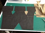
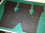
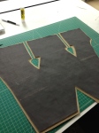
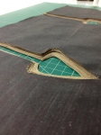
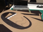
For our first major project in Type, we were assigned to study the anatomy of a group of  typefaces, choose a letterform from each typeface, and then reproduce the letterform with our understanding of it’s anatomy. I chose a Futura ‘M,” a Clarendon ‘W,’ and a Bodoni ‘e.’ The following images show a bit of the exploration and construction of the physical letterforms.

The images show the process from around the beginning to end. I added layers of paper to the ‘W’ to add physical weight to the letterform. This was because the leterform itself (as well as the typeface) was quite visually heavy due to the massive slab serifs and stems. I aimed to exaggerate and draw focus to this aspect.

Tagged , , ,
KCAI :: Image

Fall 2012