If you are reading this, you are on the old site for Nick Howland’s process blog. If you would like to continue seeing the sleep deprived workings of this designer in training, please follow me at: http://www.nahowland.com.
All the best!
-Nick

If you are reading this, you are on the old site for Nick Howland’s process blog. If you would like to continue seeing the sleep deprived workings of this designer in training, please follow me at: http://www.nahowland.com.
All the best!
-Nick
After not being all too happy with the end result of the finalized typographic mark I posted earlier (I felt like it could be more visually dynamic and interesting), I went in and tinkered with it. I think what I ended up with is far more interesting than the previous creation.
I ended up expanding the letterforms and making them a bit thicker, but not too thick as too take away from the tall stature of the letters. I took the black shadowed curve towards the bottom of the left leg of the N and continued it a bit further up the leg. The main change is the alteration of the tail on the end of the image. I felt like the original curved tail was too sharp and hard to recognize so I made it triangular and extended the shadowed area on the top left corner. The overall shadowing was also extended a bit further to reduce the amount of negative space as well as give the image a bit more shape and mass. I also took the crotch of the N and raised it a bit more to further distinguish the N from the H. The original typographic mark can be seen here while the finalized image as well as process photos can be found below.
PROCESS PHOTOS:
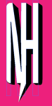
FINAL DESIGN:

Good music to design to. For Sure.
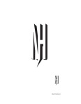
For the third and final part of Project 3, we were tasked with choosing our favorite of the 15 further developed digital typographic marks (after a full day crit) and polishing it up. The mark I chose to use was the “speech bubble” mark. I felt that this one personified myself the best; on the mind-mapping exercise, I wrote down the adjectives tall, lanky, nerdy and the plural noun comic books to describe myself. I think all of these descriptive terms can be found in the design of this typographical mark.
During the crit, the one suggestion I was given (the major suggestion I was given) was to try to to make the letterforms themselves the speech bubble. This was my main goal in redesigning and refining of the final typographic mark. I think I accomplished this. I rounded off the tops and bottoms of the letters to make them the rounded edges of the bubble itself, then created a tail by reshaping one of the legs of the ‘N/H’ form. The one thing I would like to fix (and will be fixing soon) is having the tail of the speech bubble stand out more. It seems hard to notice from a distance and it doesn’t translate well when re-sized to a smaller size. Please check back, the final finalized final typographic mark should be up soon.
Process Photos:


I originally had the tail of the speech bubble coming off the right end of the mark, but that didnt seem right. Neither did having the tail come straight down out of the bubble.
Final Typographic Mark:
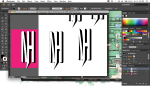
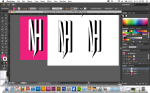
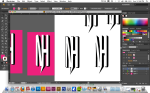
For the second part of our third project in Type 1 (constructing a typographic mark), we we took our 3 favorite sketches from the previous portion of the assignment, imported them into Illustrator, and created 5 different iterations of the mark to further explore its characteristics and design.
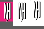
The three typographic markings I chose utilized the Univers and Futura typefaces. I felt like both typefaces were a visual personification of myself (tall and lanky). I chose the first mark because it is a way I sometimes sign my name. The captial ‘N’ and the capital ‘H’ attach well together since they are both vertical forms with tall, sturdy stems. The crossbar of the ‘H’ also connects well with the ‘N’ when the rightmost stem of the N is removed. I chose the 2nd mark to further explore the structure of the two letterforms (better exemplified on the two bottom examples on the second page). It also allowed me to study the perspective of the letters, especially when they were slightly skewed or altered. The cast shadow is a further exemplification of my tall structure and the long shadow I cast. The third and final mark I chose allowed me to experiment with the dimensions of the letterforms when placed together. Doing so allowed me to depict how there is more to me than what is just perceived on the surface (so deep).
A process photo from this portion of the project as well as the original sketches can be found here.


For the second part of the third assignment of our current Viscom project (still with me?), we continued the study of space but took a closer look at compositional balance. More specifically, we studied three different forms of balance: symmetrical, asymmetrical, neutral, and ambiguous. Diving into each principle, we were asked to define them, create 3 graphic illustrations for each, and go out into the world around us and find 1 example of each principle then photograph it. The definitions, illustrations, and photographs are directly below.
Definitions:
Symmetrical / A form of balance characterized by similar objects placed on opposite sides of a central axis, but the placement creates a uniform, equal, proportionate composition.
Asymmetrical / A form of balance characterized by objects being placed on opposite sides of a central axis but the placement of the items causes the composition to appear unequal and non-uniform. It does not look proportionate.
Ambiguous / A form of balance characterized by it’s undecided nature. The objects in the composition do not clearly or directly relate to one another.
Neutral / A form of balance characterized by it’s random and haphazard placement of objects. There is no clear emphasis.
Graphic Illustrations & Photographs


For the first part of our third assignment in Viscom, we studied space. To further understand the design principle, we chose 6 images (that we took or that we found), made them black and white, then used .5pt lines to grid out the images on a black background. This allowed us to study the spacial structure of the images we selected. My findings (original images as well as gridded images) can be found below.


Before we begin to assemble the scene for our Historical Figure constructed image poster assignment, we sketched out a plan for the imagery. This allowed us to further explore composition as well as eventual construction. I decided to actually implement a 3-D element in placing the flowing mass of paper coming out of the typewriter and reaching up the paper. This allowed me to experiment with using the wash to write the text.


For the second part of project two in Type 1, we took the typefaces we chose previously and began to transform them into typographic marks to be used as monogram logos. We did 30 sketches of possible logos (shown below). I kept in mind the adjectives I used in the mind map and attempted to create monograms that included elements of myself in them.
Next, we uploaded 3 of our favorite sketches into Illustrator and began to digitize them as we created 5 different itterations of each typographic sketch. You can see the process of the digital image making below.


Step one for project numero dos in Type 1 was to create a mind map of adjectives that we thought accurately described us. Following this, we had to select 6 different typefaces (3 serifs, 3 sans serifs) that correlated to the adjectives we chose in the mind map. I ended up choosing Futura, Univers, Grotesque, Chaparral, Garamond, and Bell Gothic. I mostly chose these six typefaces because I felt they mirrored my main physical features: lanky and bone skinny.


Fall 2012
