Monthly Archives: August 2012

VISCOM1: The Gestalt Process

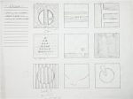
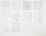
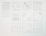
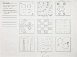
UPDATE: The completed sketches for each principle are now included. They also show the definitions, which can also be found here.

In Viscom 1, we are currently studying Gestalt principles, exemplifying our understanding by writing our own definitions, then utilizing these definitions to create simplified hand-drawn designs. Here are my current examples for each of the four hand-drawn Gestalt principles we were assigned to explore, including: Continuance, Closure, Similarity, and Proximity.


Tagged , , , ,

TYPE 1: The Process Of Project One (Part 2)

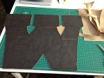
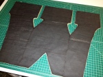
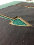
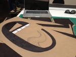
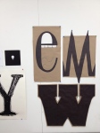
For our first major project in Type, we were assigned to study the anatomy of a group of  typefaces, choose a letterform from each typeface, and then reproduce the letterform with our understanding of it’s anatomy. I chose a Futura ‘M,” a Clarendon ‘W,’ and a Bodoni ‘e.’ The following images show a bit of the exploration and construction of the physical letterforms.

The images show the process from around the beginning to end. I added layers of paper to the ‘W’ to add physical weight to the letterform. This was because the leterform itself (as well as the typeface) was quite visually heavy due to the massive slab serifs and stems. I aimed to exaggerate and draw focus to this aspect.

Tagged , , ,

VISCOM 1: A Piece From The Portfolio

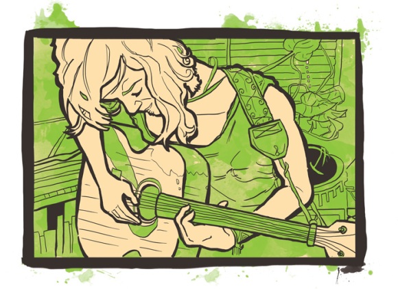
For our first assignment in Visual Communication 1, we had to bring in a small portfolio (about 6 or so images) to present and explain to the class. This is one of the images from my portfolio. It’s an image I did for fun to allow myself to experiment with digital illustration a bit more and explore a new style.
Unfortunately, this image is technically unfinished. I forgot to add the frets to the neck of the guitar. I’ll have to dive back in and do that soon.

Jen With Wash

Tagged , , ,

IMAGE: Project 1, Color Harmonies, Sketches

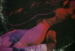
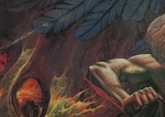
For the first assignment in IMAGE, we were tasked with photographing and exploring the 6 color harmonies discussed in class: Analogous, Accented Analogous, Complimentary, Split Complimentary, Triad, and Tetrad.

For the sketches, I chose to photograph/ experiment with album covers, which hold a vast array of colors as well as great examples of design elements. By zooming in and cropping out certain areas of each album cover, I was able to capture multiple examples of each color harmony. The hardest to find was the Tetrad harmony, which I was able to find one example of.

The only drawback of photographing album covers was the difficulty in being able to experiment with depth of field. I had to place another figure in front of the album cover to achieve this (an action figure whose color complimented the background image).

Tagged , , , ,
KCAI :: Image

Fall 2012