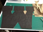
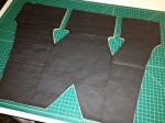
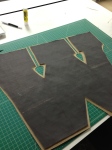
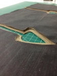
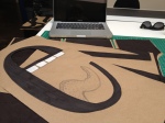
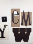
For our first major project in Type, we were assigned to study the anatomy of a group of typefaces, choose a letterform from each typeface, and then reproduce the letterform with our understanding of it’s anatomy. I chose a Futura ‘M,” a Clarendon ‘W,’ and a Bodoni ‘e.’ The following images show a bit of the exploration and construction of the physical letterforms.
The images show the process from around the beginning to end. I added layers of paper to the ‘W’ to add physical weight to the letterform. This was because the leterform itself (as well as the typeface) was quite visually heavy due to the massive slab serifs and stems. I aimed to exaggerate and draw focus to this aspect.

