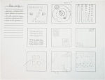
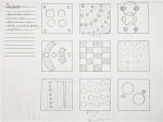
For our second project in Image, we are tasked with creating a museum poster for a dead historical character. I chose Jack Kerouac (bio here, inspiration board here). To explore the imagery we placed on the inspiration bored, we had to create 20 thumbnail sketches utilizing these symbols and various related images. The symbols I implemented into my sketches were limited mainly to a jug of wine, cigarettes, maps, book pages, a typewriter. All of these, I felt, exemplified Kerouac the best. I started sketching with the first images that came to mind and then further experimented with them by simplifying them or further pushing the design by adding different symbols or presenting the objects in a different way.
Nick Howland
Design Process Blog
VISCOM: Project 2, Symmety Transformation
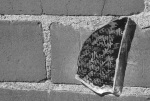
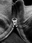
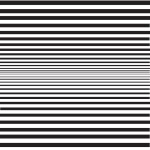
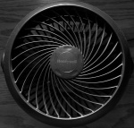
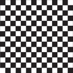
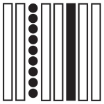
For our second project in Visual Communication, we studied symmetry. We had to define the five assigned terms (translation, reflection, glide reflection, rotation, and dilation), create five original digital illustrations for each term, then were challenged to go out and find five photographic examples of each term. My finding as well as definitions are below:
Definitions:
Rotation / Turning an object around a predetermined axis often implies movement/ continuance. Causes the viewer’s eye to follow a path created by the object(s).
Reflection / The placement of a figure on a plane of 180 degrees. Achieves the same effect as seeing the duplicate of a figure in the mirror.
Translation / The repetition of an object with each repetition spaced in uniform sequence and intervals.
Guide Reflection / Mirroring an object and then shifting it down a predetermined axis.
Dilation / The repetition and change in size of an object coupled with uniform spacing.
Photos / Digital illustrations:
TYPE 1: The Process Of Project One (Part 4)
The first project in Type 1, I feel, was all about the study of the anatomy of typefaces. It dealt with deconstructing letterforms, determining the characteristics of the letterform, then abstracting it or creating a perfect reproduction of it.
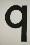
The fourth part of project one, the portion I found to be the most difficult, was recreating a letterform perfectly. We chose letterforms at random, had to measure them out, then translate those measurements to a large sheet of Bristol board. I chose the Futura lowercase ‘q.’ I definitely think I could have done better on this portion of the project. The craftmanship was well done and I kept the Bristol clean, but the linework was wobbly and should have been much more crisp. The bowl of the letterform was rather hard to paint with solid, clean lines since it isn’t a perfect circle; more like an oval than anything else. I will take what I learned on the project and use it to better the work ahead .
TYPE 1: The Process Of Project One (Part 3)
The first project in Type 1, I feel, was all about the study of the anatomy of typefaces. It dealt with deconstructing letterforms, determining the characteristics of the letterform, then abstracting it or creating a perfect reproduction of it.
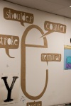
The third part of the first project was about recreating one of the previous letters we did in the second portion of the first project, then labeling the anatomical portions with the correct terminology. I chose to recreate the Bodoni ‘e’ but I decided to work on a much larger scale. Since the Bodoni ‘e’ looks like it has so much personality, I decided to once again abstract the piece and bring out its personality characteristics. I elongated the body of the letterform so that it more resembled a talkative face. Then, I cut out the terms in the shapes of speech bubbles (much like in a comic book). The letterforms in the speech bubbles are all hand illustrated, which allows them each to be different and, in turn, have their own personality as well.
TYPE 1: The process of Project One (Part 1)
The first project in Type 1, I feel, was all about the study of the anatomy of typefaces. It dealt with deconstructing letterforms, determining the characteristics of the letterform, then abstracting it or creating a perfect reproduction of it.
The first part of the project dealt with listing the adjectives we thought best described the letterform, then applying these adjectives in redesigning the letterform. It was an interesting concept to grasp at first, but I’m fairly happy with how they turned out. It was a great introduction to the last half of the projects.
IMAGE: Project 2, Historical Figure Inspiration Board
For our latest Image project, we chose a dead historical figure to eventually illustrate (with symbols, icons, and indexes) a museum exhibition poster for. Before we really dive into creating the poster, we were tasked with making an inspiration board to utilize when choosing the imagery for the poster.
When choosing the imagery for my inspiration board, I decided to focus on the qualities of Kerouac, the symbolism of the man and author. I wanted the imagery to represent Kerouac. I chose images of a wine jug (alcoholism), a California Zephyr train (which he rides at the beginning of Big Sur), a pack and hitchhiker (to symbolize his travels across the country), a neon Jazz sign (the music he listened to and was inspired by), as well as a few others. With the exception of the image of Kerouac, everything is representational of the man he was.
Click Here to navigate to the Kerouac biography for the Historical Figure project.
IMAGE: Color Harmony, Finals
Here is the final presentation for our Color Harmony project. I ended up re-shooting my images and created small scenes to add visual interest and give dimension to the photos. I tried to utilize certain aspects within the composition to help guide the eye towards the specific color harmony, such as using the cord to the headphones.
IMAGE: Project 2, Historical figure Essay
For the second project in our Image class, we are to begin with writing a short biography about the historical figure we chose in our last class.
Jack Kerouac was born Jean-Louis Kerouac in 1922 to a French Canadian family. He is often referred to as the “king of the beats,” for he was a prolific and integral member of the Beatnik movement: a post-World War II literary moment that wrote about the rejection of materialist qualities seen amongst the public, experimented with different literary styles as well as drugs, sexual freedom, and illustrated inspiration from eastern religion (namely Buddhism).
Kerouac largely wrote autobiographical works. His popular library, cumulatively known as the Dulouz Legend, consisted of twelve books total, but included: On the Road, Big Sur, The Subterraneans, and many more. Kerouac’s style draws inspiration from the Jazz and Bepop music he listened to during the time he was writing, so it has a natural, rhythmic bounce to it. It flows just as a song does. Throughout his books, Kerouac explored topics that were thought of as risque for the times: allusions to homosexual actions, alcohol, and experimentation with drugs.
Since Kerouac was largely inspired by the world around him, his novels often include vivid descriptions of nature. Throughout his books, one of the main occurrences is traveling across the country (normally through hitchhiking). Kerouac goes out of his way to make you feel like you are there with him by using very vivid descriptions.
Kerouac was a heavy drinker, a burden that eventually lead to his untimely death. Kerouac greatly abused alcohol and when he was 47, he began to have internal bleeding and liver problems. After throwing up blood for some time and eventually visiting the doctor, he passed away.
Click Here to navigate to the Inspiration Board for the second project in Image (Historical Figure).
VISCOM 1: Project 1, Gestalt
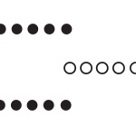
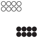
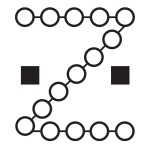
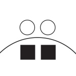
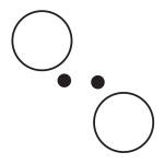
For our first project in Visual Communication 1, we explored select Gestalt principles. We first came up with a textual definition and then created sketches of each principle. Then we selected three of each set of sketches and transformed them into simple digital illustrations. Finally, we took photographs of the principles in the world around us. You can see my findings as well as the definitions and illustrations for each principle below.
Definitions:
Similarity / Objects that share similar visual characteristics are often viewed as belonging together.
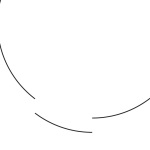
Closure / Viewing an incomplete object and wanting to mentally complete it.
Proximity / Similar objects that are placed close to one another are often perceived to be in a group.
Continuance / A group of figures / objects that are arranged to imply movement through the group.
VISCOM1: The Gestalt Process
UPDATE: The completed sketches for each principle are now included. They also show the definitions, which can also be found here.
In Viscom 1, we are currently studying Gestalt principles, exemplifying our understanding by writing our own definitions, then utilizing these definitions to create simplified hand-drawn designs. Here are my current examples for each of the four hand-drawn Gestalt principles we were assigned to explore, including: Continuance, Closure, Similarity, and Proximity.


